Poppy Universal Typeface
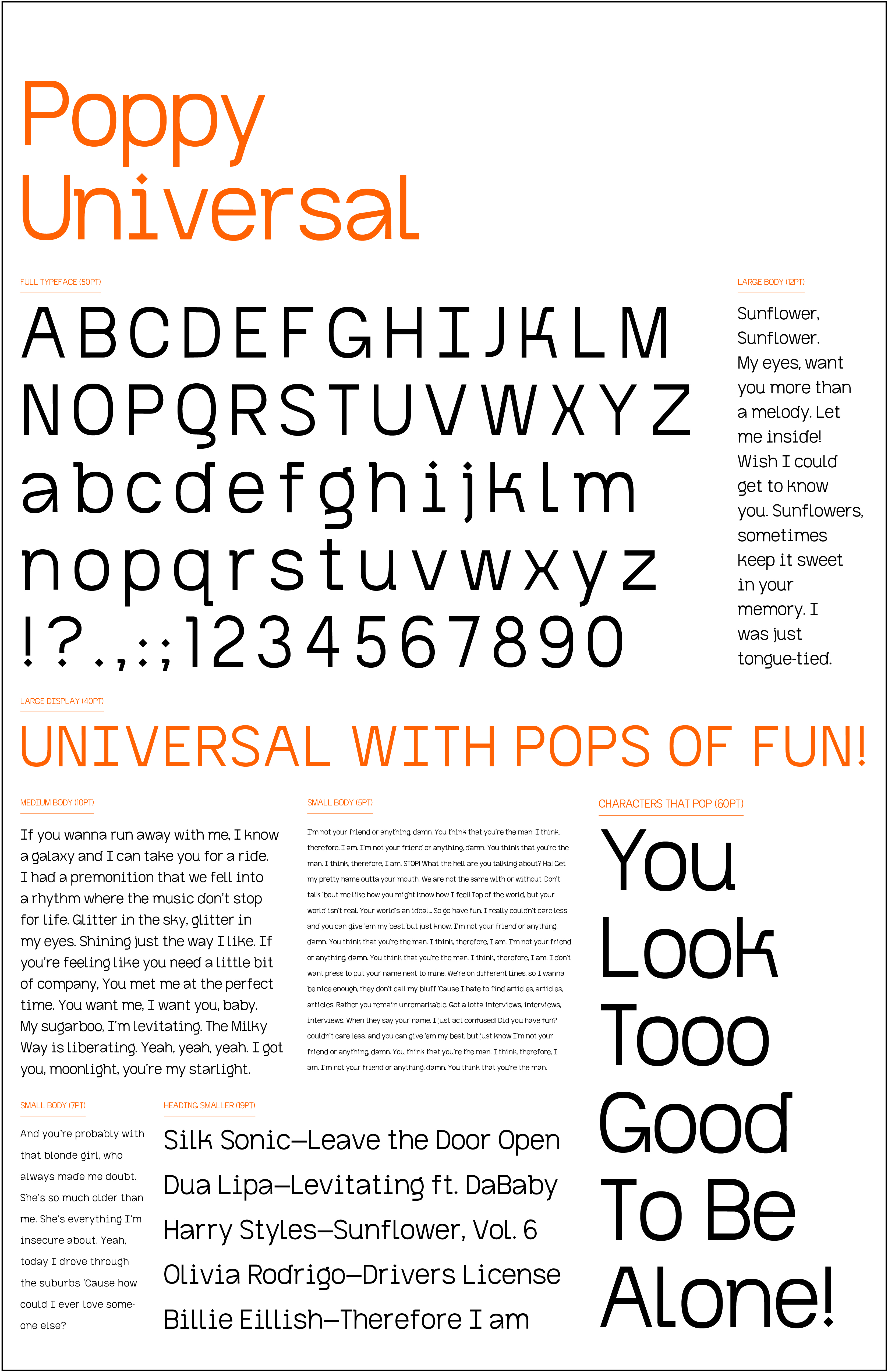
This typeface was designed based on the Grotesk style of type. I was drawn to Grotesk typefaces in the mood boarding & exploration process of this project. I enjoy their simplicity, but each Grotesk font has elements that “pops” and make many of the characters unique. I particularly enjoyed making the Gg’s and the Kk’s of this family after developing a funky spur. This project taught me a lot about the geometry and complexity of each letter. In particular, how to reuse parts of the system.
My style frames were based on the Billboard Top 100 songs at the end of this project. With the name poppy, I wanted to represent the pop culture of the time as a time capsule. This typeface was developed while listening to a lot of these songs, so it was only right that they were represented in the end.
My style frames were based on the Billboard Top 100 songs at the end of this project. With the name poppy, I wanted to represent the pop culture of the time as a time capsule. This typeface was developed while listening to a lot of these songs, so it was only right that they were represented in the end.
TYPE DESIGN
FALL 2021